
-
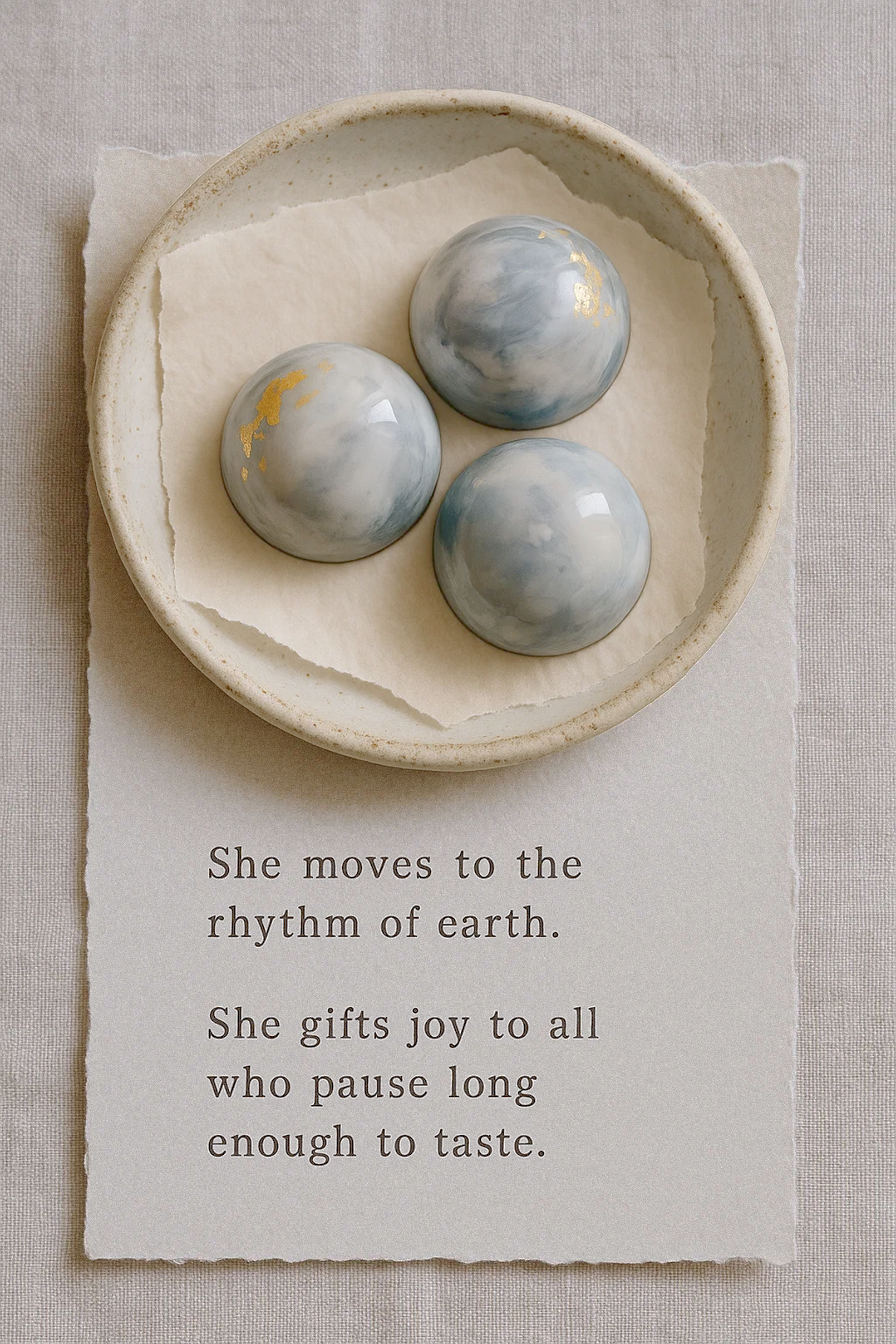
Aewen Chocolates is a devotion to softness, stillness, and sacred indulgence.
Rooted in myth and made with care, each piece is crafted to honor quiet joy and the beauty of presence. Inspired by feminine ritual and the rhythms of nature, Aewen offers chocolate not as a treat — but as a moment to return to yourself. A sensory offering for the soul, carried in silk, wrapped in light, remembered by taste. -
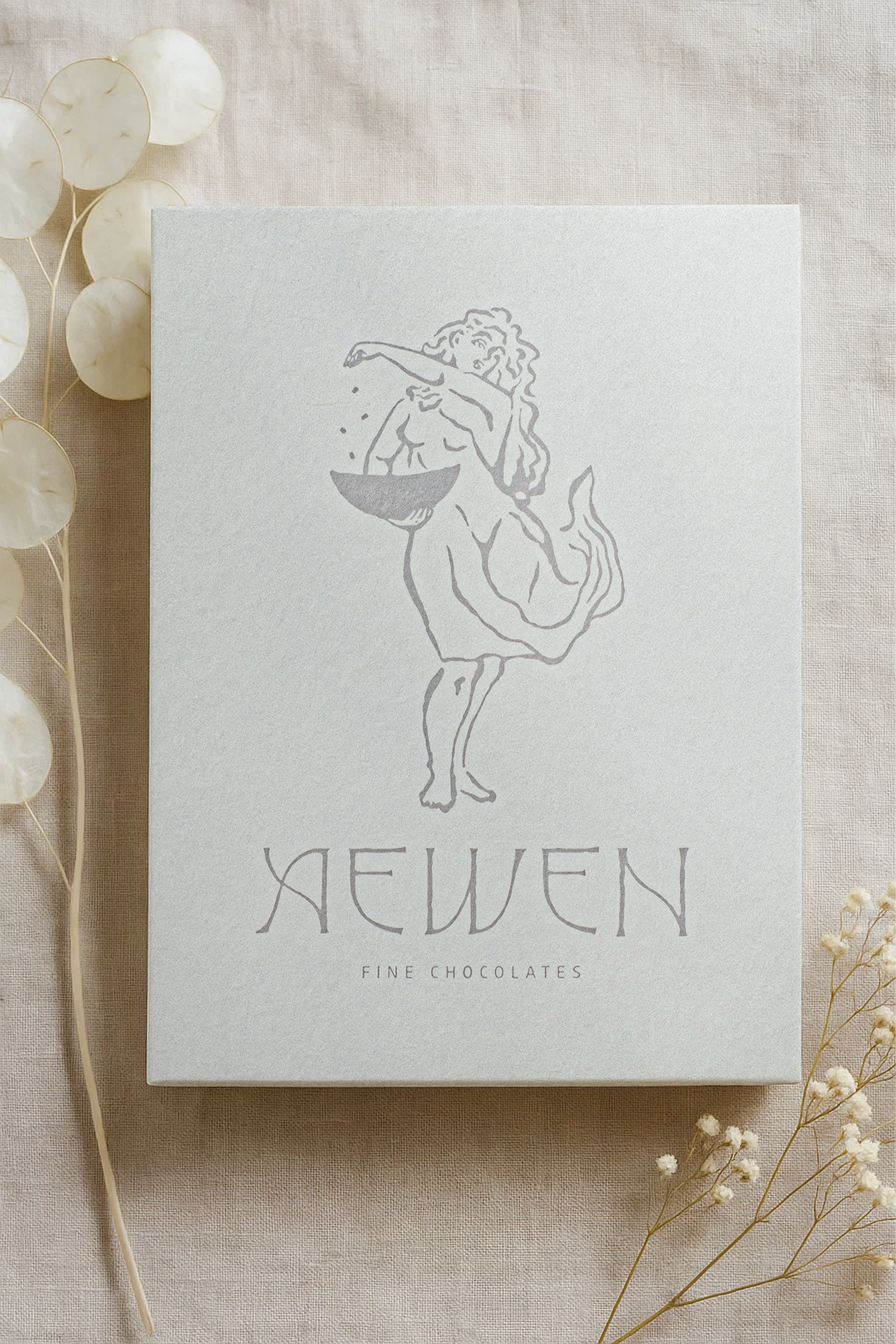
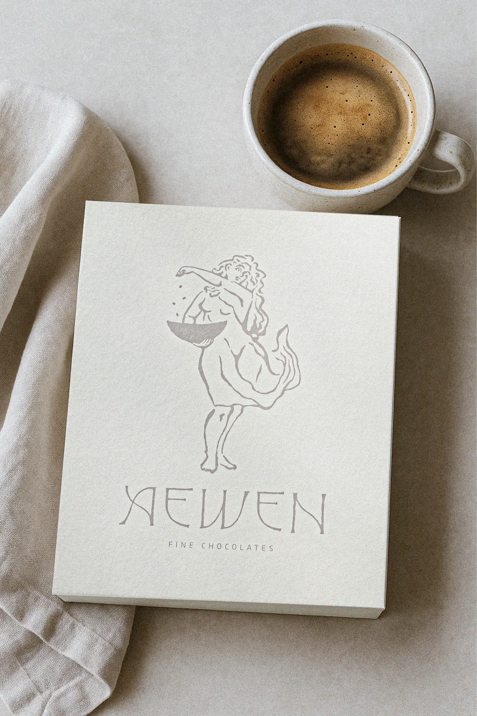
We collaborated with Coco to create a wordmark that feels timeless, soft, and quietly powerful — designed to echo the world of Aewen. Inspired by medieval type, folklore lettering, and the rhythm of spoken myth, the letterforms feel both historic and modern. The gentle curves, wide spacing, and sculptural balance give the logo a sense of stillness and grace.
This pairs beautifully with the hand-drawn illustration — both elements feel like they belong to the same world: feminine, rooted in ritual, and shaped by nature.
-
2025 · Alabama, USA
Custom Wordmark
Illustration by Rise Wise -
Photography: Aewen Chocolates